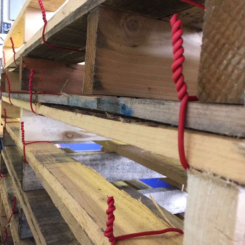
POSH, anthropomorphic wires?

Yes, long before Victoria Beckham sashayed her way into our consciousness as Posh Spice, I had a tyrannical headmaster who terrified and taught us stuff in almost equal measures.

One of the lessons which stuck with me (along with speed-reciting of the 9 times table for fear of being combusted by the Times Table Dragon) was his understanding of the origins of the word posh; Port out, starboard home, which was how the better-off colonialists sailed out to India and the Empire, back when that seemed like a good idea. That way you travelled on the shady side of the ship, out of the blazing afternoon sun – the port side (left if you’re on the ship) heading south, and the starboard side (right hand side on the ship) when you head back north.

I have been thinking about global trade of goods as I made the work for Nothing Endures But Change, which is part of the Waterloo Festival. The colours I have used and the orientation of the work reflect that mythical description of the word: I think a lot about the trade in power and privilege which dictates where all the stuff we buy is manufactured by lower-wage workers. This ongoing exploitation/natural flow of capitalism and industrialisation (depending on your politics I suppose) (and how guilty I wake up feeling that day) seemed to be relevant in the context of class and status, and the questionable title of posh which some are labelled with.

Then when I looked into the name further, it seems the origin is more interesting, stemming from the street term for money which was used by criminal gangs in the 19th century. This feels a bit like reclaiming the word, it being used as slang for wealth, rather than as a sort of put-down. The fact that the myth about the ships headed for Asia has proliferated almost reinforces the system of class and entitlement which the underworld operated (operates) apart from. So that’s a fortuitous reference to start with.

Then, in the making, to cheer myself up (and ease the guilt I felt as I considered what had been shipped where on the pallets I’ve used) I made all the wires point up. Is it possible to have cheerful, optimistic wires??

I hope you can join me on the 6th for a walk round the sculpture garden, I’ll see you there at St John’s Churchyard, 73 Waterloo Road, SE1 8TY from 6 pm.

Owning our own

Well the new data rules have successfully flushed out all the mailing lists I willfully granted may email address to over the years, flooding my inbox in the short term, promising me a more serene future… although I have no legal know-how to chase down the inevitable exemptees from distant lands… my favourite notification came from the fabulous folk at Who Gives a Crap loo roll (check them out, they are cheap and plastic-free, support excellent charity work, and are amusing)

The email took ages to load so I thought it looked like this:

Screen Shot 2018-05-25 at 08.38.59

I thought ah, brilliant, they are so right-on that they dont need to update their policy, they already do all the right things.

Then when I checked back, it was indeed a data use update, but included this pic, so all good.

e578af7a-389a-44e3-93ff-1512874d5678

I’m enjoying the reactions I’m hearing about the new opt-in rules. Hardly anyone seems to appreciate what I see as a pivotal moment when organisations (including yours truly, a humble artist just trying to invite you to things) have to be transparent about the fact that they hold our data on file. Today it’s worth noting that most of the websites I use on a daily basis (social media) are based on a genius business model : make a platform, then have the users spend their time populating it for us, then gather lots of useful facts (data) about them which have a market value. Bingo. We do their job for them and are grateful for the oportunity. Yes they provide us with a service, we get to write random tomes and share our interesting pics to friends out in the ether, but it’s worth reclaiming your own value in the process. They need us more than we need them.

Just a thought. Happy long weekend. May the sun shine on us all.

Thank you for reading btw. Here is an invite to the next oportunity to see my work, from the 6th June at St Johns in Waterloo, part of a show with The London Group & Friends at the Waterloo Festival this year: Nothing Endures but Change.

TheLondonGroup_at_WaterlooFestival2018.jpg

The Principle of Sufficient Irritation

The London Group President’s Prize show 2016 at the Cello Factory with Martin Heron and Darren Nisbett

Last year November my work was selected for exhibition in The London Group Open, which is a biannual event showcasing the work of current members alongside the same amount of works by selected contemporary artists. The membership is thriving, with around 90 members, so the show was spilt into two parts and hung in a salon style.

The current main gallery used by the group is the Cello Factory on the Southbank. As the name suggests, it is a converted space with high beamed ceilings and skylights. The award of this space and the time to work in it meant that I was able to conceive a piece which is much larger than previous works. 


‘Cloud’ is approx 4m x 4m x 3m and is suspended in the space, stopping before it reaches the floor. The salvaged wires are a mix of power, telephone and data cables, and have all been connected into one circuit here, with two tiny LED bulbs proving agency. This is an opportunity to experience a physical relationship to the copper cabling we are surrounded by and depend on for our life services, including communication, conversation, and data exchange. The material is unified by a small current, so the imagined past uses of the wires might bleed into one another, and have their current forms extended a little. They have been spared the scrap-mans’ smelter for now. 


I am also exhibiting 2D drawings for the first time, and I see those in terms of physical exploration too: Following my residency in Beijing I have been processing my experiences there in many different ways. One of the ways I have been trying to discover what this orange object is for is to draw it and draw it. No matter how closely I look I still cannot work out how it might be connected. They just stood on top of telegraph poles there as rare beacons of colour in the thick, flat air.


Martin Heron takes his background in large scale public art installations as a starting point which he is able to position his work against at 180 degrees. In contrast to large heavy works designed to live an age, here he salvaged scrap metals and allowed them to have some say in how they are treated. Martin manipulates his materials until they seem to have said ” stop!” They crease and fold according to previous marks, and colours in the form of paints and tapes respond to altered angles and lighting too. 
They protrude from the wall at intervals, giving an airy colourful illusion to their sharp edges. They are displayed at head height, which I feel places some of the responsibility for taking care back onto me, activating a personal interaction.


Darren Nisbett is showing a photographic series chronicling his exploration of abandoned and derelict industrial machinery. They are printed on guilted and textured metal, which transforms them into becoming relics themselves. They might be as decayed as their subjects. 

They are dark and imposing, mixing the mechanical with the possibility of the anatomical, and the scale of the original objects I hard to ascertain. Small clues suggest their enormity, and the dark row of frames moving along the wall of the gallery seems to have a mechanical rhythm of its own.
The three of us had not met before we won the award last year, but were instantly drawn to the shared interests of our work. We met regularly throughout the year to discuss the theory and practicality of staging a coherent group exhibition, and I think that these conversations paid off through what we have produced. The installation was well planned over three days, and went very smoothly. This luxury of time opened up our plans from an early stage:

As a photographer Darren knew he would show on the wall, and as a space based sculptor I was keen to exploit the height of the space. Martin makes sculptures which are often displayed on the wall, so the balance was struck. 

I calculated logistics and materials before I arrived, but was not sure of the final form the work would take. This was dictated in part by how the cables I chose behaved on the day, and in part by how the space was transformed when the wall works were installed. 

As the rich dark photography and the colourful textured sculpture went up, it became clear to me that my cables should only be black, and the coloured and white wires of my collection were packed away. I began with the heavy, smoother cables, a mixture of data and telephone wires, which draped more elegantly in the heights between the beams. As I moved lower to the ground the work narrows, but still appeared to be floating upwards, and so the lower section is made from solid core power cable which is more capricious.

I worked with the title in mind, as it was the only part of the making I could be sure of before I began. This is part of my explorations of the communication network and our interaction with it, and the hanging form gives a monumental presence to materials we customarily ignore or are insulated from.
I also produced a publication to accompany the exhibition, with writing by Susan Haire, the president of The London Group. 

This was made by Risograph, which is a relatively analogue technique in the field of printing; kind of a mechanical screen printing process which uses vegetable inks, banana paper and large drums to reproduce the images. This gives a warm tactile print quality which is often slightly off-calibrated reminiscent of hand production. It seemed relevant to the materials and interests included in the publication is presented in a limited edition package which also contains three samples of metals, one produced by each artist in the show. These are available from the artists.
To conclude the exhibition on Thursday the 10th of November we are hosting an evening of artist talks where all three exhibiters will be presenting their practice. Refreshments will be served. All welcome at 6.30 pm

@2_by_3 with Alia Pathan and Bex Massey

We decided to organise ourself as 2 by 3 as a structure within which we could explore similar interests in sculpture, objects and presentation. This resulted in our first show Death of Intention which explores the roles of objects and space in how we experience and interpret the world written about by Walter Benjamin.

The fluid process of producing this show resulted in a open and new installation which feels autonomous and optimistic. The time to curate and install together has given it the feel of a residency- an event which is often characterised by noticing the luxury of being able to prioritise and focus on your practice, slightly removed from the demands and distractions of daily life. Over the course of four days we had two days to initially install our proposed work, and the remaining time allows for experimentation and exploration along the themes proposed by Benjamin, around the themes of barriers, obstacles, agency and negotiating space.

IMG_5487 IMG_5490

Alia Pathan works predominantly in time-based media, presenting thoughtful digital film and media installations which explore the deapths of human experience and connection. For Death of Intention she has thought about the deliberate construction of an apparatus we can use to experience her media work. Materials and construction are common themes in all the work presented in the space, and this work Peter, Pixel & I, uses carefully manufactured structures and objects to invite us to move around the work, explore as much as we dare. I can avoid looking at a film of a medical procedure if I stand to one side, choosing to be selective in how I look at it, mimicking the official policy towards the market in such procedures during the soviet era which informed this work. In thinking about the official ‘blind eye’ which was turned to the doctors and ship which worked in international waters, the artist has also produced a silk flag which simultaneously interrupts the space and provides a backdrop to the films. The luxurious surface invites me in as much as the printed design of eye operations repels me.

In the next space the heavy contrast of cast iron sits on the back wall, spelling out the image of a cat in raised characters which could be read blind. The Cyrillic ‘shhhh’ form in the Center, once I’d had it translated for me, suggests the silent complicity of the operation of duel systems.

IMG_5491 IMG_5496 IMG_5510

Bex Massey is skilled painter of photorealistic images, who has always considered modes of display beyond the sole canvas. In the past she has used leaking daylight, objects as props, and juxtapositions with mass produced materials to support her paintings. For Death of Intention she has not dispensed with paint altogether, but here it has taken  a supporting role, used to highlight physical elements which allow for the themes to prevail. The combination of crafted objects with organic elements gives the work the same slightly precarious sense seen in earlier  works.

The main space holds two pieces, ‘Seasonal sculptures’ number one still employs abstract canvases, balanced one on the other here,  as a backdrop to a cast object. The painted reproduction of a pineapple is topped with a regular a top sliced from the fruit. The pineapple is colour and pattern- matched to the canvas, whilst the colour of the pineapple top is reflected in the section of artificial turf which supports all parts. This limited palette ties the selected objects together, somehow making sense of the variety. The slender vertical presentation gives a poetic sweep to the assembly.

Seasonal sculpture number 2 consists of a junior school chair supporting a slice of watermelon. The chair has been restored and repainted in white on one side, fluoro pink on the other. The pink is reflected in the flesh of the watermelon which has been remade whilst still presented in a piece of cut peel. The organic elements in these Seasonal Sculpture series lend a sense of tension and termporality, making me want to cherish the looking while I can, before they topple or rot away. The simple bright colour on the child’s chair lends an element of playfulness to the work, which is tempered for me by the faux offering of the fruit.

The sense of dashed hope of nourishment continues in the next room, where chips are referred to by potted yellow flowers. They are potted in McDonald’s fries pots, supported on a crafted shelf against a slash of red and yellow on the wall. The movement of the first piece is here, and the simple palette too.  These sculptures are a departure for the artist, yet the unmistakable lineage is plain to see, which I find really interesting. How this happens and what we do with it is one of the questions we asked of ourselves in creating this show.

Drawing work and ideas out of the usual métier into something more 3D, sculptural, interactive, invites a different experience from the viewer, just as it is a new way of thinking and working for the artist.

IMG_5471 IMG_5508

Personally, the work I presented seems to be stretching my practice from both ends: the multiples which make up AQI (air quality index) are bookended by a working circuit of power cable with exposed bulbs and contacts in one direction, and by gestural canvases in the other. The circuit is one of the most quiet, distilled works I have shown. It’s fascinating watching how it is interpreted, as I try and gauge if it is pared back enough, or too much… The concept seems to be communicating itself, with the audience spontaneously approaching and activating the work. The cooperation and interaction required to complete the circuit is a new explicit element, whilst the execution of the basic materials themselves keeps the focus on the object/materials themselves.

The oil and wax paintings are physical interpretations of some of the imagery I collected during my residency in Beijing last September with Red Mansion. The abundant stimulation and input of all senses which I experienced will continue to feed my work, but in flattening it into two dimensions, I am distancing myself from what was an intense physical and emotional period, and this allows me to better process it objectively.

IMG_5517

Tracey Payne Breathing Space Eastbourne

Thinking about sea air and escape from the metropolis I set off to find Tracey Paynes work in The Labyrinth in Eastbourne. The name of the venue should have been my first clue that, as always with Paynes work, all is not as it seems.
The Labyrinth is a little Victorian shopping arcade which has somehow survived development by secreting itself away and changing as little as possible since the last time a bustle was worn down it. The businesses occupying it have changed, but the commerce goes on, it is very much alive as a space.
Installed in a new truncated art space being explored by Curious Projects is a work which is also alive and breathing. Made from contemporary sail material in vibrant orange and sky blue, Breathing Space rises up at me from behind the glass bay shop front and catches me unawares. I had actually walked past it at first, though the colours didn’t go unnoticed. I turned back to peer in at the deflating form as it slowly slumped back below the windowsill.
Suddenly it sprang into life again, taking a deep motorised breath, filling out and rising above my head. This optimistic expansion, this deep intake of air was contained against the panes of glass. It climbed and climbed to no avail, displaying it’s cheerful colours pressed against the limits of the space. At last, as it occupied as much room as it could, it conceded, turned off, stopped trying.
The title and the location suggest optimism for space, and this is the commodity in most short supply here. This duality is often seen in Paynes work, most recently at Art Lacuna and at the Camberwell Salon at Unthank Artspace. The playful materials and installations have the joy of possibility in them, and manage to remain beautiful and enticing even as they exhale: they never do escape.
This determined attempt to occupy the space, the repeated thwarting of it, but ongoing tries nonetheless makes Breathing Space a work which I spent a good while with, ever hopeful of its success, ever entranced by its withdrawal.

IMG_0256.JPG
Tracey Payne, Breathing Space, 2014

Missing Narrative @BrixtonEast

Missing Narrative E-Flyer

Exhibition open: 30th July – 3rd August 12 – 6pm
Private view: 31st July 6 – 9pm
Symposium: 1st August 3 – 5pm

Brixton East Gallery

Visual arts often communicate something that is beyond vocabulary. Language is often inadequate, language is unable to translate the visual and the visual’s relation to words. [painting and music] “will always be over and above anything you can say about it.” Jean-Paul Satre.

Missing Narrative explores what is absent, something that is incomplete but perhaps implied. The idea of a work in transition exuding possibility but not actuality. The ‘mystery’ of the final coming together of elements in the artwork and viewer can become implicit in the narrative completing the works meaning. Philip Guston said “The painting is not a surface, but a plane which is imagined. It moves the mind. It is not there physically at all. It is an illusion, a piece of magic, so what you see is what you see.”

Artists:
Rose Bell
Mel Cole
Gin Dunscombe 
Cadi Froehlich
Clare Harford
Alice Kelway-Bamber 
Monika Kita
Sasha Morris 
Sue Stephens
Kim Thornton 
Billy Ward 
Edgar—Walker 

Guest Artists / Symposium guests:
Ann Course
Karl England
Rebecca Fortnum
Claudia Sarnthein
Gregory Williams

More guests TBC…

Choc full of Martin Creed @haywardgallery

20140130-090426.jpg

I’ve never seen the Hayward so full of work. From the moment you walk in you are hit in the eye and ear and almost-but-not-quite the head. It made me smile straight off. Martin Creed’s work always does make me smile. There is a playful irreverence about his work, but he presents it to us all the same. I got the sense of him trying things out. The fact that he takes it seriously enough to stick at ideas gave the work an integrity which I found I didn’t get at all from a similarly irreverent David Shrigley at Hayward last year.

I couldn’t help comparing the shows in my mind as I walked around this one, but where Shrigley seemed determined to undermine his own work, which made me want to do the same after the first few pieces (you want me to take this body of work seriously? It makes me smile a bit, but seriously, how many one-liners can I take in one show?)
What’s the Point of It? is more of a stream of streams of thought, overlapping and repeating, which felt interesting to witness.
The work that almost-but-not-quite literally hits you when you first enter is the monumental revolving neon Mothers. The way it is shoehorned it into the space, sacrificing a walkway and giving you a squashy sofa to wimp out on is quite breathtaking. I prefer standing there and getting the hairs on the top of my head whisked up as it swoops past. When I first heard Creed talking about this work a couple of years ago,  Creed said it had to be large, “because mothers always have to be bigger than you are” and because “it feels like mothers are the most important people in the world.” This stuck me as respectful rather than patronising: I think it’s the ‘s’ which opens it up for all of us. We can all personalise the tribute I suppose. Motherhood being such an lifelong status, with all the paradoxes it presents – illuminating, intimidating, amusing, liable to bonk you on the head if you grow a bit more…. I could spend a lot more time with these ideas.
I did get to spend a lot more time with a lot more of Creed’s ideas, sometimes wondering why I was being asked to spend time with more than one incarnation of some. The stacks of boxes and iron girders, for example. But not chairs or lengths of wood. The everyday verses the sourced? The crafted versus the ordered from stock? Was it even that deliberate? Those inconsistencies I think were interesting, but in the room where light featured wasn’t so successful: the lights turning on and off were great: I think that added to the broccoli prints, and to Mothers, enhancing the features of both; but there was a projection on one wall which came on and off with the lights which felt clumsy. It seemed coy amongst work which was delighting in being straightforward and observational. It seemed to be a decision governed by practicality and I couldn’t get past that. The bronze peony in an unappealing vase sitting next to it also seemed out of place, much more of a material experimentation (the very long lasting flower made immortal although it looked quite dead… Material pun?)
The material puns were continued with the tape on the wall upstairs. A huge wall was meticulously striped in all different tapes. They weren’t holding it together, but they could almost have held it up. Made me want to fix a few walls in my house like that. Such a simple gesture, yet the hours of sourcing and the painstaking perfection of the application gave it substance. This was true of the walls in general, which are all painted in various ways, but with different paints or rollers or brushes which gave it more intention than randomness.
All of this pondering is rounded off by a room behind a wall glazed with different sorts of glass. (Following the Scotsman Steps in Edinburgh made of different shades of marble, the wall of tape, even the rather forlorn wooden screen downstairs crafted from different types of wood, the uniform is made question by these explorations into material variations)
Behind the glass wall, the space is un-neatly divided in two: half the air there is in great big balloons (or possibly, slightly less than half- I think the static on my hair made one or two explode.) The megawatts of static might be an indication that I stayed in there a bit too long, but it was fun.
Fun, and unnerving too. Coming face to face with strangers you didn’t know were there. Laughing hysterically like a child at a birthday party fulfilling old fantasies of enough balloons to fill the lounge. Paying for it with a birds nest painful tangle on the top of my head. It brought to mind the immersion in Cildo Meireles’ Volátil talc room at Tate Modern a few years ago, or Miroslaw Balka’s How It Is in the Turbine Hall, the unsettling possibility that something might happen to you is never far from your mind. This foreboding gesture is echoed by the slamming piano lid earlier in the show, the stranded, animated car on a roof. This is a deliberate act, otherwise why not just fill half the room with one ballon?
The insistence of Creed to draw us into his way of seeing and exploring the world seems generous rather than imposing. The smiles and belly laughs balance the more reserved, quiet, reluctant moments. The bored looking pianist serenading us with every note on the keyboard over and over again seemed privately humiliated, yet he did it anyway ( I hope this performance style was in the job description).
Having enjoyed looking at Creed’s work ever since I was first introduced to it on my art foundation, I was really excited to see some pieces I’d only read about before. (I was so busy on the MA I didn’t make it to see Mothers at Hauser and Worth) I did miss any reference to the Bells from the cultural olympiad though. Hopefully this is due to it being ubiquitous now, what with so many of us taking part? Or maybe its just me who still has the ringtone on my phone?
The work feels like an ongoing process, rather than a fixed presentation, which I find really refreshing. As the 2 years of intensive fertilisation and replanting, which led to the agricultural show which was the end of MA show at Chelsea last year, start to really sink in, it’s heartening to be reminded that making art is a lifelong obsession in the wider world too. What’s the Point of It? Is more than just a title of a song, or a show, it’s a call to arms for making more work, to try and find out.

Ides of March @ Space Station Sixty Five

Ides of March

It was really different working with the arbitrary group of 9 out of the 20 on our course. After 18 months we have a rapport which covers our professional approaches to decision making, and the roles individuals tend to be drawn to when we take on new projects. The thing we all have in common is the work. We have all come so far and worked so hard to get here that we are able to make sure the work comes first. The difference with this show and the being only half the group was that we had the luxury of space. This meant we could show work in the place which was best for each piece of work: Often in a group show the main concern is how to fit all the work in most successfully. This gave the work space to breathe, and I think resulted in a show which looked considered and united.

I showed 2 works in the end, Access and Sentinel.

Froehlich.C.3.Access

Access was made and adapted to the space once I had seen it. The opportunity to create an obstacle across the corridor ( an imagined blockage) was ideal. The wires all gathered around a power and data socket area, and immediately began to take on anthropomorphic qualities. I tried a couple of different layouts, and the space to do this in was brilliant.

The difference the lighting made was also really interesting, as the top lights really made the copper inside the wires glint, bringing it to the attention of the viewer. Watching people tiptoe through it all night was very interesting.

Scooping them all up at the end of the night seemed a bit disrespectful. It broke the illusion of considered placement and respectful treatment. It turned them back into merely wires rather than artworks. What is the difference?

What could have gone better or differently?

The wires are grouped mainly in fives, but there are a couple of fours and one three. This should be all the same or all varied otherwise they stand out.

I’d like to see how they look on a neutral ground. The green edge in the gallery actually worked really well against the coloured wires, but it would look different again on a continuous surface.

More numerous groups of one colour would look different too.

Someone who had even the larger piece at Machine For Living In at Hannah Barry last year said that it looked like that had shattered into all these smaller pieces, which seem more animated. Imagine if these grew to that size, that many of them would be really imposing. Then they would all shatter into a huge field of small ones and so on. This could be the beginning of a much longer project. This feels exciting, but daunting.

Making sculptures takes up a lot of space. My studio is not large, and as it is under threat at the moment, I am nervous about what I take on. The practical considerations of sourcing all the materials is another matter all together, and transportation too. After the last week of driving up and down to London by train and by car, running the gauntlet of a fatality on the line, replacement busses negotiated whilst carrying heavy objects, snow and train cancellations, motorway congestion and closures, I am really exhausted. I am giving this my all willingly, but every now and then I get The Fear. Can I keep this going? Physically emotionally and financially this is painful. How far should I push it? How far should any of this influence what I make and how I make it? Ignoring all of it and carrying on regardless is one option, which I will undoubtedly take, because that’s typically how I operate.

But is any of this belligerence in deliberate defiance of the Other Fear: Perfect Studio Syndrome? (the work I would really be making if only I had the perfect fantasy amount of time/space/money/all three) I don’t think it is- I conjure the memory of Louise

Bourgeois and her standing pieces at times like this. She made tall thin arrangements out of scraps she collected in her neighbourhood when she lived in New York. She worked on her roof where the the view was of tall thin buildings. I also imagine Eva Hesse on her kitchen table mixing bowls of latex and tubes. ( Though admittedly most images of her work were shot in a large looking studio)

The threat of losing my studio has prompted a flurry of ambitious larger scale plans, in a now or never sort of mentality. The tutorial last week was also really helpful. Like a rocket up the arse. But uncomfortable, but gets you there much quicker than you would have otherwise been.

The next six months have been so many years in the coming, they deserve to get lavished with the most energy I can possibly manage. Managing the balance between the course, the making, and my other commitments is much more challenging.

CF-Sentinel

Sentinel was not as successful as access regarding placement, though I was really happy that the supports I had made worked so well. It was stable and elegant. These were not properties it possessed last week. The danger element needs to be part of it, though ideally no one will actually get squashed. I think having them above us on the platform might have reduced the impact you get when you stand alongside them. There was also no risk here of having your ankle or eye snagged on one of the wires. I do want it to have a presence though, and it certainly had that. I am going to work on how they relate to each other and threaten us a little more. This will do for the interim show, although I have other plans for work for that- it just depends on the people of Brighton deciding to replace their hot water tanks over the next couple of weeks, and I have not control over that. Of course I could search farther afield…..

Susan Hiller; Channels at Matts Gallery

IMG_0089

Susan Hillers’ latest show at Matts Gallery is shown in a space adjacent Mike Nelson’s More things (To the memory of Honoré de Balzac) in a pairing which adds weight to each. Somehow they share a pallet, the blue here implying that temporary in-between when changing input, providing moments of escape next door in Nelson’s work. They tansported me out of the spaces, with Hiller taking my thoughts out beyond my body, and Nelson suggesting a sideways experience.
It reminded me of Le Corbusiers Chapel at the Convent of La Tourette, as I was bathed in an earie light, subtly changing.
In presenting what is ‘not intended as a religious consolation nor ‘new age’ fantasy’, Channels employs a wall of TV screens to bathe us in sound and light. In doing so, it captured me, and before I knew I had been sitting there for 20 minutes, worshiping the ubiquitous, all-knowing technology which sits in the room with most of us these days. The factual accounts of Near Death Experiences were undermined by the unfamiliar orientations of the screens, and the result transcended statement, leaving me questioning how I absorb the emissions and suggestions from the big flat face in the corner.

4-01-SHwebleft-2-sm 4-01-SHwebright-sm

Light Show at Hayward Gallery

You and I, Horizontal, Anthony McCall

Lighshow at Hayward didn’t appeal at first, but I went along with other enthusiasts and was won over. I think I had preconceptsions of decorative and illustrative (may I be struck down by an Arc inside a Cube)- I am all too pre-occupied with the materiality of works, and assumed that work would be about the effects of the materials, rather than the mechanics of the sources. This was both proved and disproved:

Anthony McCall successfully overcame my prejudices with his installation in a dark space with some smoke effects, creating the illusion of a cone which took on more solidity the more I played with it and tried to mentally establish it was pure light. The wonder of the other audience members was fun and slightly self-consious- we all knew it was just light, yet even I found myself trying to walk round it rather than through it on leaving….. I think this was an intimate conjoring trick which wanted to be intimately interracted with. For me this was the most abstract and successful projection peice- others such as Ann Veronica Janssens ‘Rose’ which emplyed lights in a red space with smoke effects felt more laboured to me.

Slow Arc inside a Cube IV, Conrad Shawcross

The illusion I had feared was square-on engaged with by Shawcross, who exploited the industrial light source and the manufactured precision of the cube to distort my spacial understanding of the space- it was hard to move around as the shadows played on all surfaces, constantly changing. It invited us to focus on the effects of the light source, of the industrial mechanics, and gave me a sense of forboding and uncertainty, as if the now and future could slip at any moment.

Chromosaturation, Carlos Cruz-Diez

Chromosaturation flattened the colours available to my eye, as if we had stepped into a solid space of colour. Sharing the space with all sorts of people was unifying, and the contrasts were provided by white cubes which were facing 2 zones at once, marking the changes in the hues. I was not prepared to be so engaged by pure colour on a conceptual level: in some ways it was the lack of colours we were looking at. Fantastic.

Magic Hour, David Batchelor

The quiet conviction of Magi Hour was undeniable, and the more I looked at the work the more I liked it- the reclaimed light boxes, the mixed screens of different hues and opacities providing a wide halo of colours speak of metropolis. The intimacy of the workings made them seem less relevant, and the tangle of wires spoke to me about the assumed networks which enable the effects of modernisation which we take for granted. Thanks to Gin Dunscombe for this image.