
I was pretty pleased with how the installation of my work went- preparation is all after all. Still not quite resolved the display of Contact. This was my most recent work and the one which I was most keen to have critiqued.
Notes from the crit:
- Having Contact sitting flat on the shelf does not invite people to pick it up- photo shows how it was replaced on the shelf after everyone had passed it around (and added to the work by leaving marks on it too- excellent).
- The form is recognisable, but is somehow beyond technology which is frustrating.
- Like a gold ingot only better.
- Disenfranchised from technology.
- Act of holding it somehow meditative.
- Heavy, like a ball and chain.
- Decadent- but needs to be held in the hand to get that.
- Gold coloured with associations of power and desireablity.
- Freudian reference, the connotation of holding an object in the hand is pleasing.
- Lots of comments around gold. Think they getting too much gold from the colour.
- The surface reflects your image, it comes out to you rather than drawing you in.
- There is a magpie-like desire to steal it.
- It is very Apple. This corporation has a huge set of connotations around it- scale, brand awareness, desirability,
- Communication.
So from all of this I can see that the colour is creating impressions which I didn’t intend but which seem in line with my intentions. The strong and immediate Apple reference is good for me, as I take all the connotations of the brand and then some- I see it as the pioneer of revolutionising the smartphone phenomenon, which in turn has transformed how we interract with the rest of the world. Personally and professionally.
No one really got the prints and marks as proof of contact. No one commented on the making and finish, which I think was good as I take that to mean it was not significantly noticeable. The colour of this bronze is an issue for me. The copper content was completely lost. I’ll be interested to see if the bronze casts I am making change that at all.
I realise that casting them along with all the iPhone details is going to be a completely different piece of work, rather than a refinement of this one- the explicit reference will imply reproduction and devalueing (hopefully).


The comments I recieved about Figure:
- Looks a bit wonky.
- The two elements look really disparate.
- The way the wires disappear under the wall add a sinister edge, like it might be a snake which might twitch.
- The flat cross-section of wires is very beautiful, reminiscent of venetian glass (mille feuille?) Expand.
I am happy with all of that. I am happy with how it stood, it’s interraction with the wall. The cross-section is something I have reproduced as an image and it sold out so that is something to explore. Feels more abstract, less literal, which may be an interesting route. Am always haunted by the spectre of making work which might be ‘didactic’. Work which says it all and dies before you get to the end of it….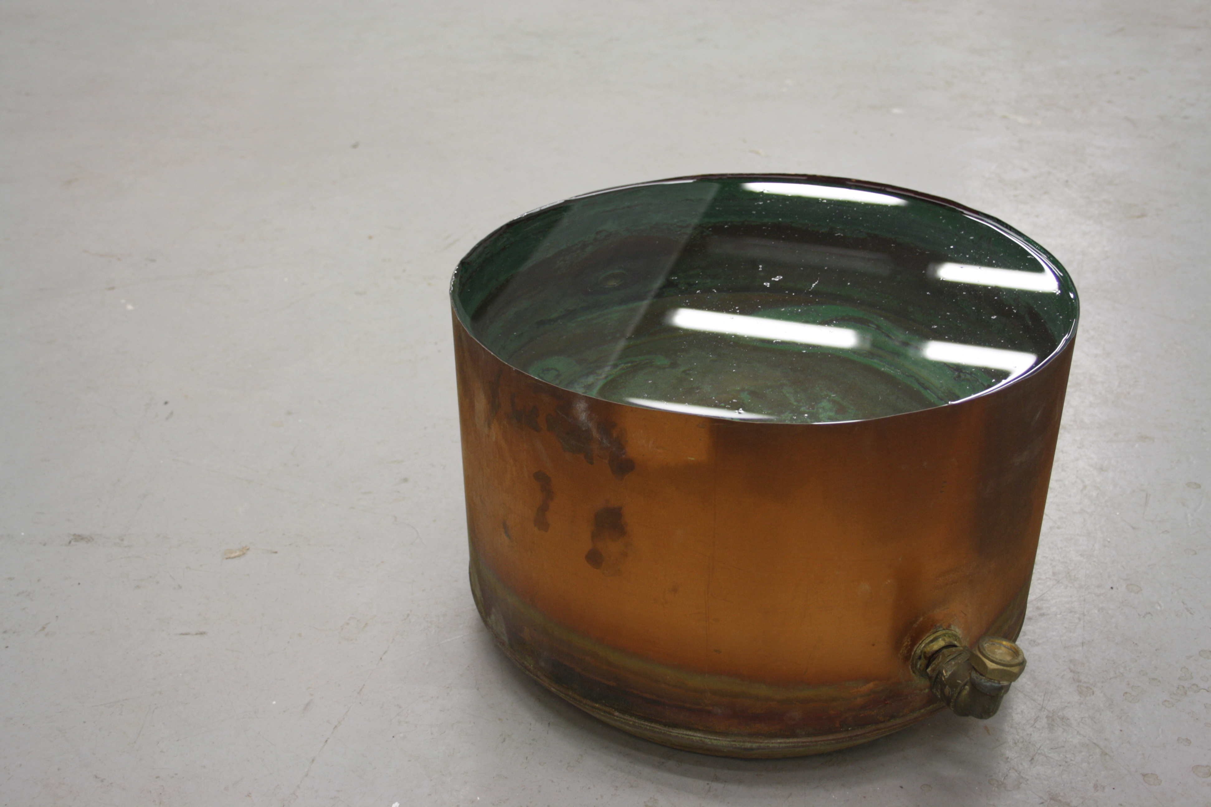

Leave a comment